Design: Hinch Single Malt Labels
This was a special one. The Single Malt and Peated Single Malt labels marked the first Hinch distilled liquid to go on general sale (distillery exclusives aside) a milestone years in the making. It was also the last project I worked on before leaving Hinch, so it holds real meaning for me. When I joined in 2019 as the foundations to Hinch were being dug, this was what we were all building towards.
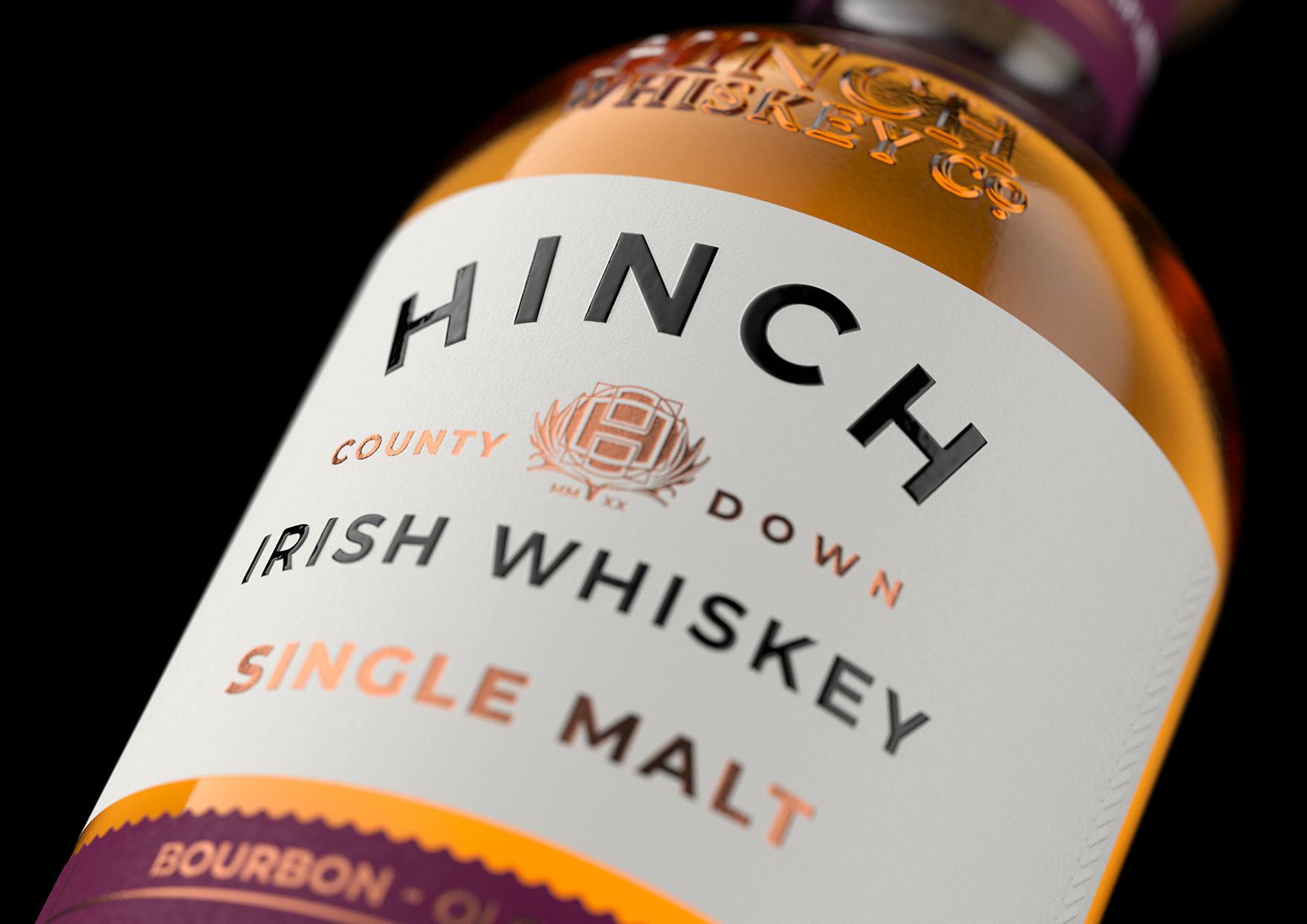
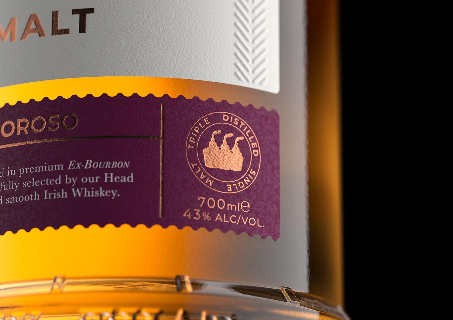
The brief I set myself was to create labels that felt distinctly new while still honouring the existing range (though keep an eye out, they may get a facelift also…). They needed to be clearly different from the sourced liquid releases, yet retain familiar brand cues, most importantly, a prominent Hinch logo.
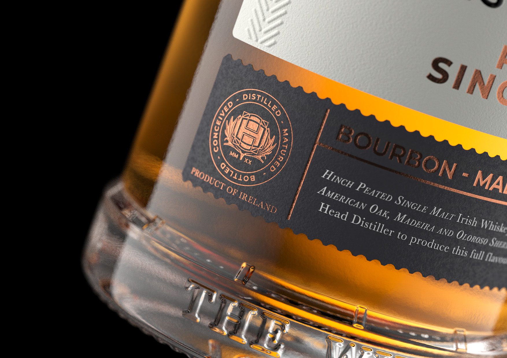
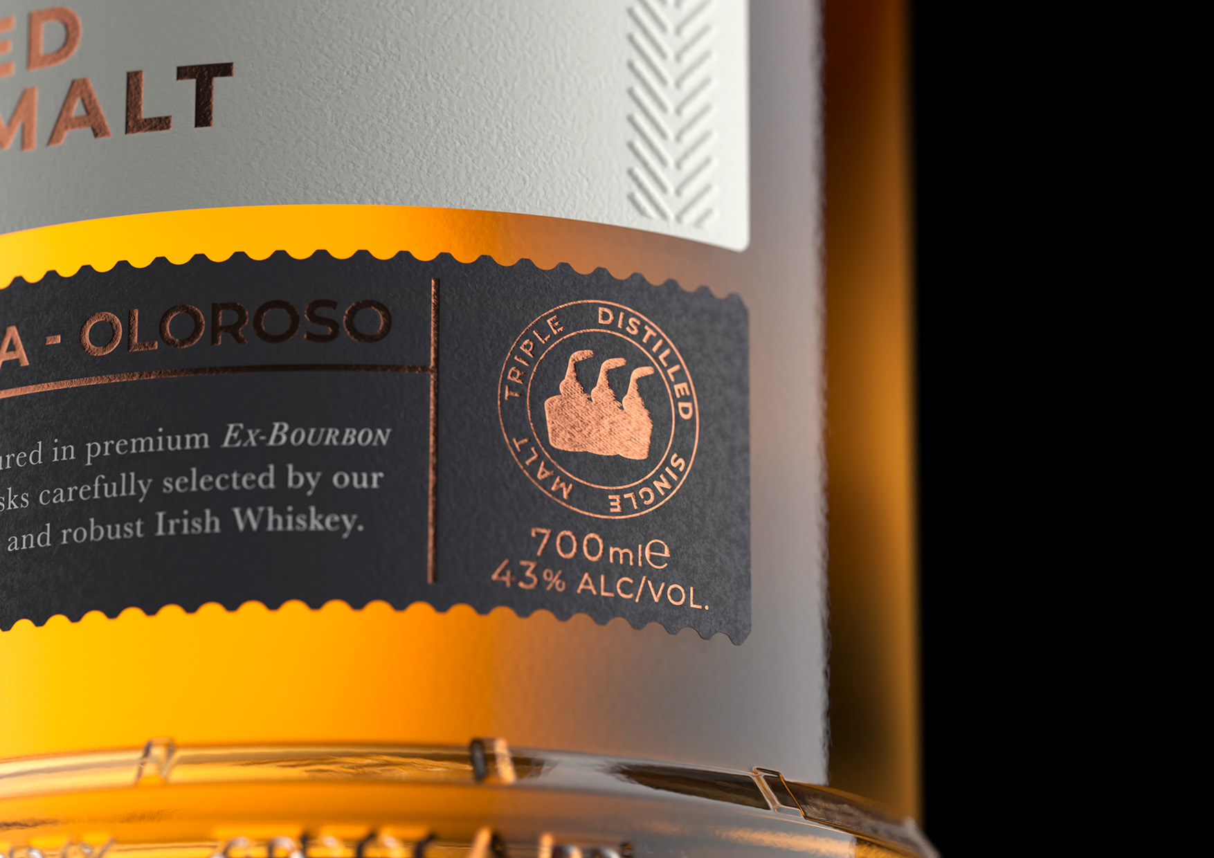
To maintain continuity across both SKUs, the top label stays all but consistent, while the lower part of the split label uses colour to differentiate each expression. A key feature is the foiled roundel stamp, proudly stating “Conceived, Distilled, Matured and Bottled at Hinch Distillery” a small but significant detail that captures the importance of this release.
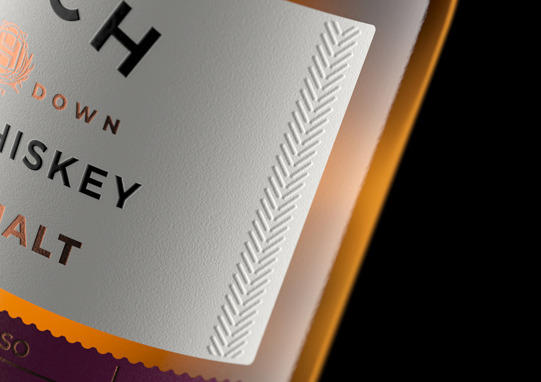
Up top, the logo sits alongside the product type (e.g. Peated Single Malt), while the lower panel carries the cask maturation details. Subtle side embossing denotes 100% barley , a quiet nod for those who know their whiskey.
Material choices reinforce the premium feel: a refined off-white stock for the top label, gold foiling for elevated cues, and a silk-screen gloss on key elements, particularly the logo, to catch the light and add a considered finish.
This project represents the heart of what Hinch set out to achieve, a whiskey truly their own and it was a privilege to help take it from concept to shelf.